Change the report results’ visualization options by pressing “View”, and then changing the available visualization options. You can choose from the different visualization types and change their options in order to display the data you need and exactly the way you want it to look like. The available options for visualization are:
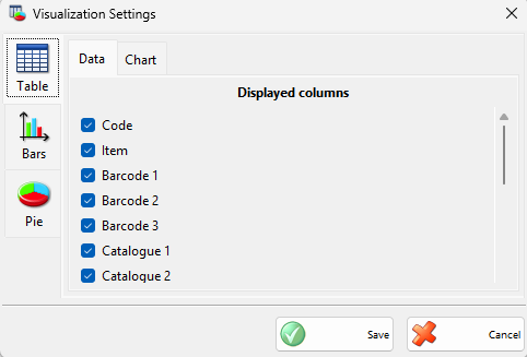
Table view (the standard view for the reports). You can choose only the columns you want displayed so they fit better on the panel size you choose. You can also choose to have the column totals calculated and displayed at the bottom of the table. Another handy option is to select a custom refresh interval for this panel so it refreshes automatically regardless if a global refresh for all the panels is specified.
Bar view (a total of 8 styles for displaying data). Display a Bar chart by choosing a column to be used as criteria for grouping together rows from the report result, and one or more value columns to be used for collecting value information that will be summed for all the rows with the same group column. Bars in the Bar chart represent all the groups and their size depends on the summed values of all the rows in that group. If you have selected a column for grouping which contains date information you have also the option to group together the rows that are within the same day, month or year. Another available option in this case is to choose an overlap mode which allows you to stack together groups that are in the same month or year. This is a very handy option to compare statistic information. Another page with settings allows you to choose the style of the bar chart and the 3D look that best fits your needs. You can also choose if you want a legend to be displayed and its position. Another handy option is to select a custom refresh interval for this panel so it refreshes automatically regardless if a global refresh for all the panels is specified.
Pie view (display a pie chart). Display a Pie chart by choosing a group column to be used as criteria for grouping together rows from the report result, and a value column to be used for collecting value information that will be summed for all the rows with the same group column. Slices in the pie chart represent all the groups and their size depends on the summed values of all the rows in that group. Another page with settings allows you to choose the style of the pie chart and the 3D look that best fits your needs. You can also choose if you want a legend to be displayed and its position. Another handy option is to select a custom refresh interval for this panel so it refreshes automatically regardless if a global refresh for all the panels is specified.